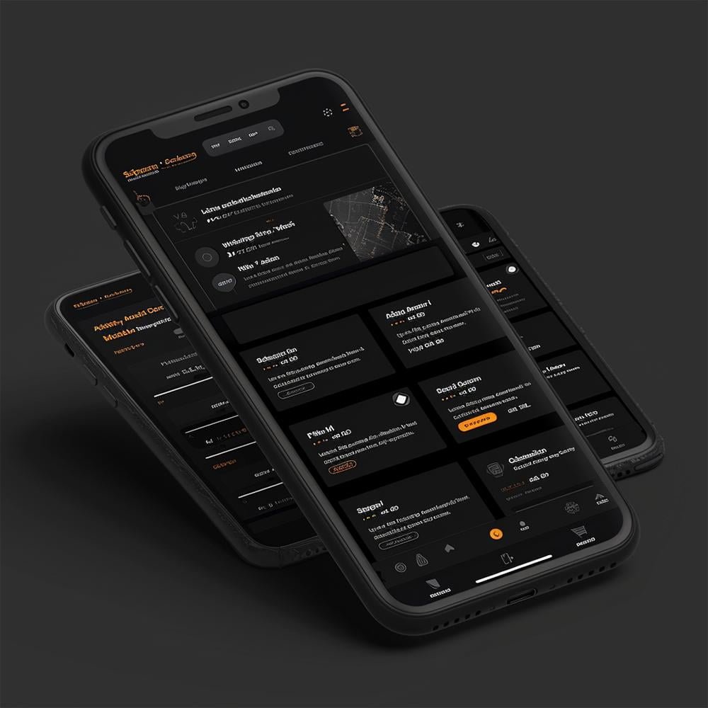
Mobile Responsiveness
Mobile responsiveness ensures that your website looks and functions perfectly on all devices, including smartphones and tablets.
With more than half of all web traffic coming from mobile devices, having a mobile-responsive website is crucial. Our responsive designs automatically adjust the layout, images, and navigation to fit any screen size, providing an optimal user experience regardless of the device used.
This not only improves user satisfaction and engagement but also boosts your SEO rankings, as search engines like Google prioritize mobile-friendly websites in their search results.
Steps For Your Mobile Responsive Website
Everything listed below is available, but not necessary for every project. During our consultation we can decide on a plan based on your specific needs. We want to provide the best price for each customer, so feel free to mix and match services to fit you.
Initial Consultation
1- Schedule and conduct an in-person or virtual meeting to discuss your mobile responsiveness needs.
2- Fill out a detailed questionnaire to gather information about your target audience, typical user devices, and any specific mobile features required.
3- Outline the project scope, including estimates for number of pages and any specific functionalities needed for mobile devices.
4- Discuss and agree upon the project budget and timeline for completion.
Research and Analysis
1- Analyze the target audience’s device usage patterns to prioritize design and testing on the most common devices.
2- Analyze competitors’ websites to understand their mobile design strategies and identify best practices.
3- Industry Trends: Research current trends in mobile web design to ensure the website meets modern standards and user expectations.
Design Phase
1- Create wireframes and mockups for different screen sizes (desktop, tablet, mobile) to outline the structure and layout.
2- Use a responsive grid system to ensure consistent and scalable layout across devices.
3- Present the wireframes and mockups to you for feedback, and make necessary revisions.
Development Phase
1- Responsive Frameworks: Utilize responsive design frameworks to build a flexible grid system and ensure consistency.
2- Adjust the layout and design elements based on the screen size.
3- Ensure images are flexible and can scale appropriately based on screen size, and set the viewport meta tag.
4- Use fluid typography that scales based on the viewport size.
5- Optimize interactive elements to be touch-friendly with appropriate sizes and spacing.
Testing Phase
1- Device Testing: Test the website on various device view ports (smartphones, tablets, desktops) to ensure compatibility and performance.
2- Cross-Browser Testing: Ensure the website works correctly across different browsers.
3- Test the website at different screen resolutions to ensure all elements adjust properly.
4- Test touch interactions and gestures (e.g., swipe, pinch-to-zoom) on mobile devices.
5- Performance Testing: Measure and optimize the performance of the website on mobile devices to ensure fast load times.
Optimization
1- Compress and optimize images to reduce load times without sacrificing quality.
2- Minify CSS and JavaScript files to reduce file size and improve load times if needed.
3- Implement lazy loading for images and other media to improve initial page load times.
4- Reduce the number of HTTP requests.
Launch and Deployment
1- Conduct a final review of the website to ensure all mobile responsiveness issues are addressed.
2- Set up the hosting environment and configure the domain name.
3- Deploy the website to the live server.
4- Live Testing: Perform a final round of testing on the live server to ensure everything works correctly.
Post-Launch Support
1- Regularly monitor the website’s performance and user experience on mobile devices.
2- Regular Updates: Apply updates to the website’s code, plugins, and frameworks to keep it current and secure.
3- Collect and analyze user feedback to identify and address any issues related to mobile responsiveness.
4- Provide technical support for any issues that arise post-launch.
Finalization and Delivery
1- Deliver website passwords, account info, and anything else needed.
2- Provide constant maintenance and support if needed.
3- Deliver files, images, or any relevant info.
*Prices may vary depending on your needs and ongoing support.